While I was wrapping up the final touches on my Ultima VI map at the end of 2016 I was already brainstorming how to go about making a map of one of my other all-time favorite RPG video games, The Elder Scrolls V: Skyrim.
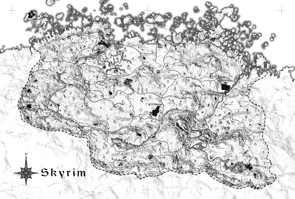
If you’d like to skip ahead to see the final result, see the images at the end. Otherwise, read on to find out how it was made!

The goals for this project were: 1) it should be practically useful to someone playing the game, showing useful terrain and locations without being too spoilery; 2) it should avoid breaking the fourth wall, appearing less like a video game map and more like an actual artifact created by someone living in that world who just happened to be an astoundingly accurate cartographer; and most importantly, 3) it should look dope as hell.
Creating this map consisted of three main phases, each of which took somewhere around 6-8 weeks. First there was programming to extract game info and generate some images. Second was manual illustration work to turn those images into a completed map design. The third and final phase was hand inking that design onto paper.
1. Programming Phase
The first step in mapping the game was gathering as much data as possible. My worst-case plan with this project is perhaps I could simply walk around in the game and use some kind of console command to get my coordinates in the world, and from that polled data I could build up a crude map. Happily it didn’t come to that, and accessing the game data directly from its data files wasn’t too difficult.
Height Map
At the most granular level, Skyrim’s world is represented as a simple elevation map. An x,y grid of samples spaced at approximately 6-foot intervals gives very rough structure to the terrain. More complex details are represented as objects placed onto this mesh. Since any x,y location on the map only has one elevation value it means overhangs (such as Solitude’s cliffs) must be represented another way.
A lot of very early experimental data came from Skyrim Creation Kit exports, such as the height map. This initial data was often incomplete or low in fidelity but was a wonderful starting point.
Elevation data allowed me to do my very first meaningful renderings. If I got nothing else from the game files, this would still have been an amazing starting point for more manual mapping efforts. Happily, that was just the beginning of what I was able to extract.
Water
Other than basic elevation, the next most important thing is water. At a minimum you have to be able to trace where the shores lie. Tracing that out manually would be difficult. For the sea you can simply set a sea level and say any elevation below that is under water and anything above it is dry land. That gets you pretty far and is trivial to do, however Skyrim is very mountainous and has many inland lakes, rivers, and ponds at various elevations. They’re too important to ignore and too numerous to sort out by hand.
The map is divided into “cells”, a grid of squares each 63 yards on a side. Each cell has metadata attached to it, including a water level value. It’s coarse but gets you most of the way there.
Skyrim Creation Kit allows you to view and edit these cell water levels but has no way of exporting them. So I wrote an automation script that went into the dialog for each cell, copied the value, and pasted it into a text file. That got me my first viable water data. But it had errors due to timing issues with the automation script and was really slow to run. Up to this point all my data was coming from SCK, and I was quickly running into the limits of what I could reasonably extract from it. I was going to need to learn how to open up the game data files myself from code.
Data Files
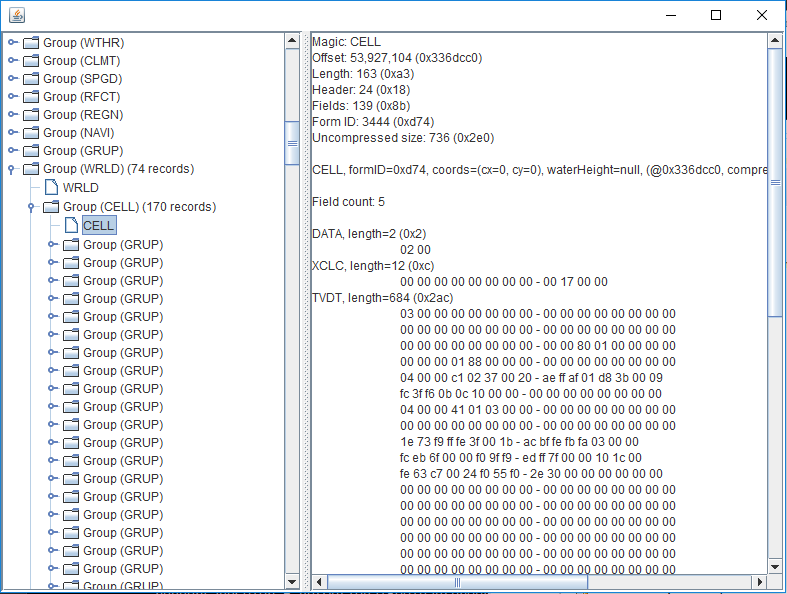
There are two basic kinds of data archives in Skyrim: BSA and ESM. A BSA file is a bit like a zip file. It’s simply a collection of other files, including textures, images, and 3D models. ESM files are for smaller bits of information, sort of like a database. They contain things like object locations, data on spells and enchantments, item properties, scripted sequences, and more.
Both the elevation data and cell data live in the ESM, so that’s what I set out to decode first. Its structure was pretty strange to me, but happily The Unofficial Elder Scrolls Pages had amazing info on the file format. Like many file formats, it’s block based, so it’s easy to process the parts you care about and skip the ones you don’t, which means there was no need to decode every single bit and byte just to get the few things I needed. One stumbling point is I initially was looking at the documentation for Oblivion’s ESM format (Tes4Mod) which does have several differences from Skyrim’s, so I spent a lot of time guessing at things needlessly.
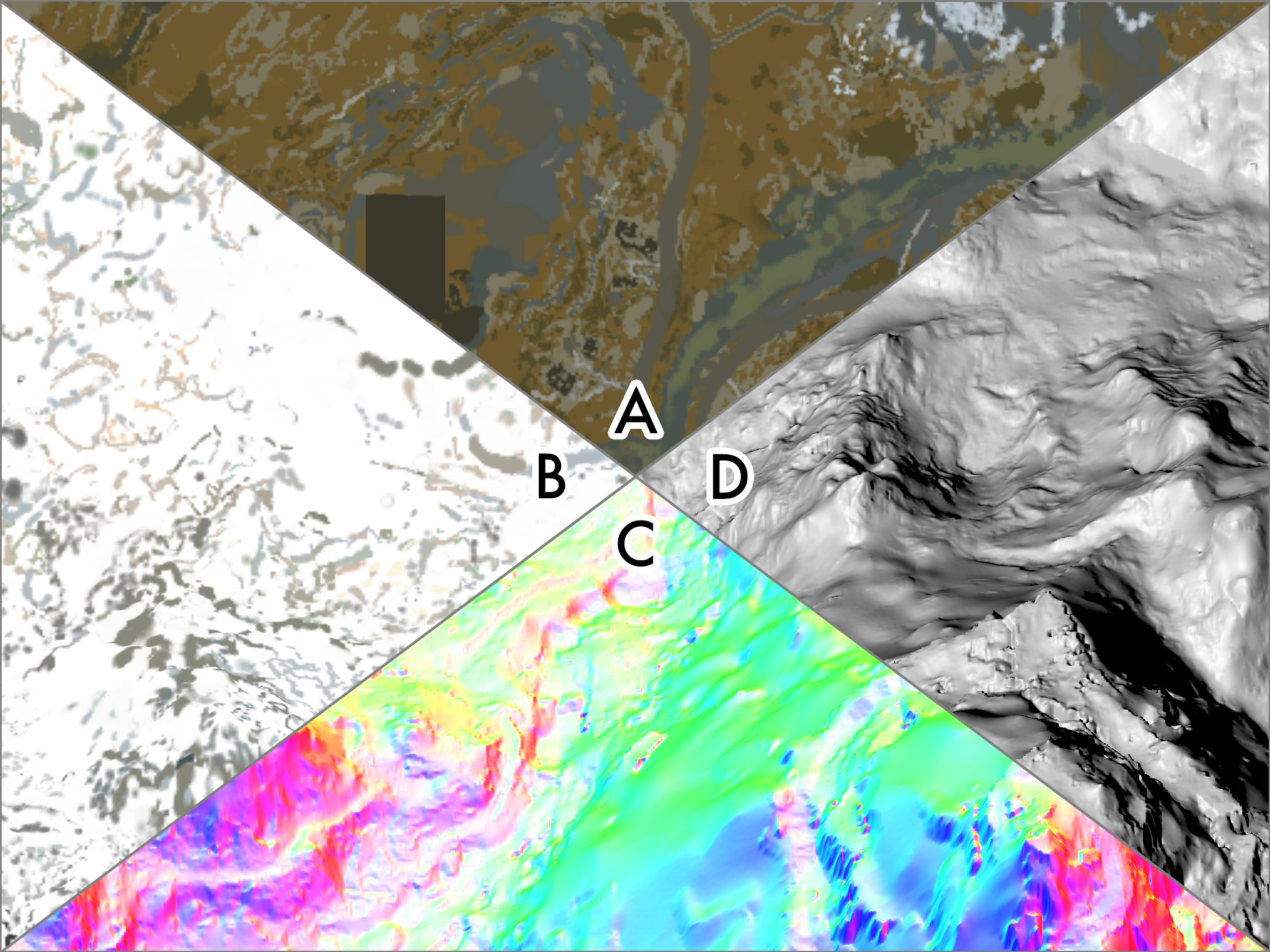
I also figured out how the land’s texture info was stored, and after writing some code to open up BSA archives and some buggy but serviceable code for reading .DDS texture files, I was soon able to get much more authentic looking landscape renderings.

Objects
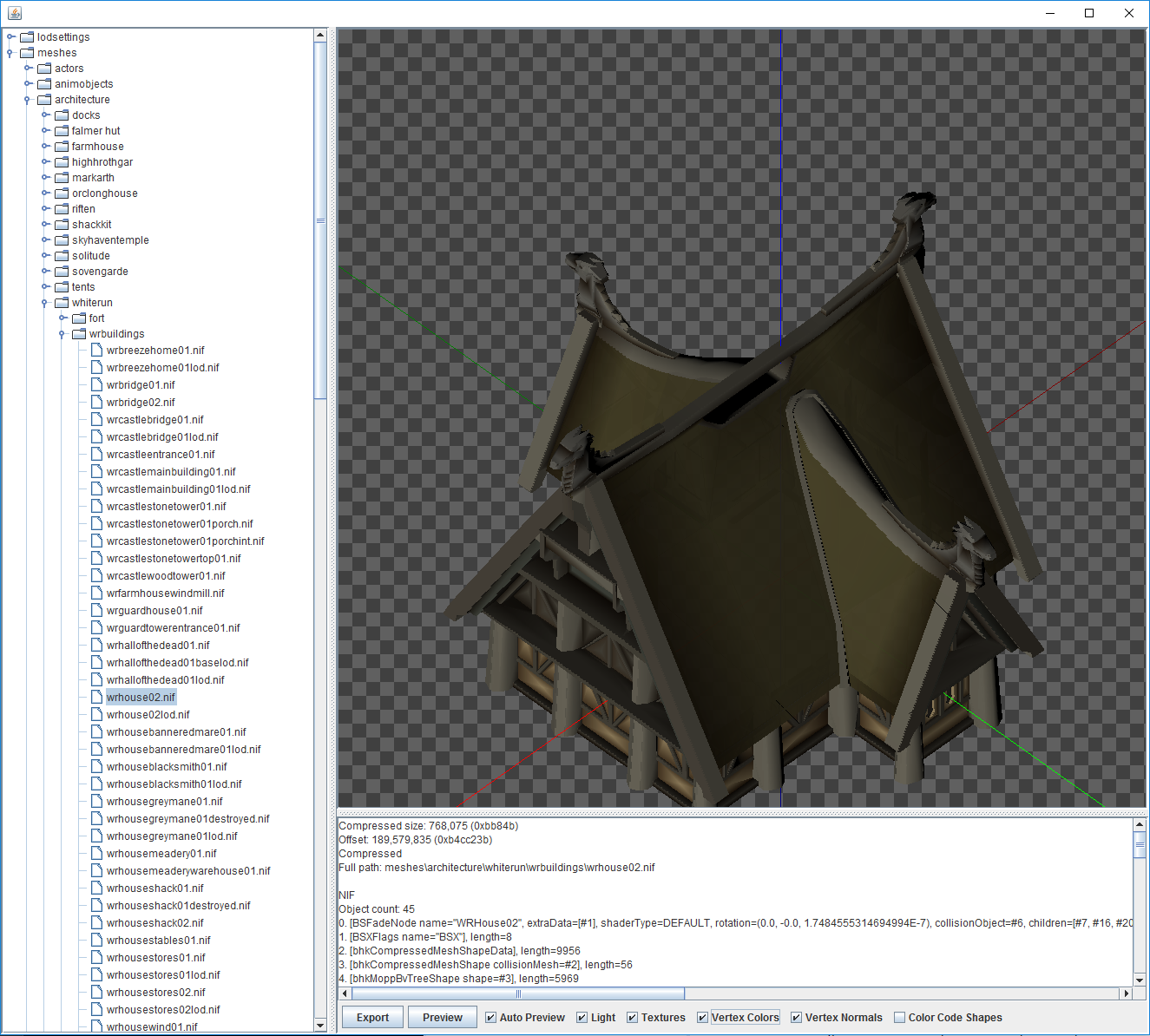
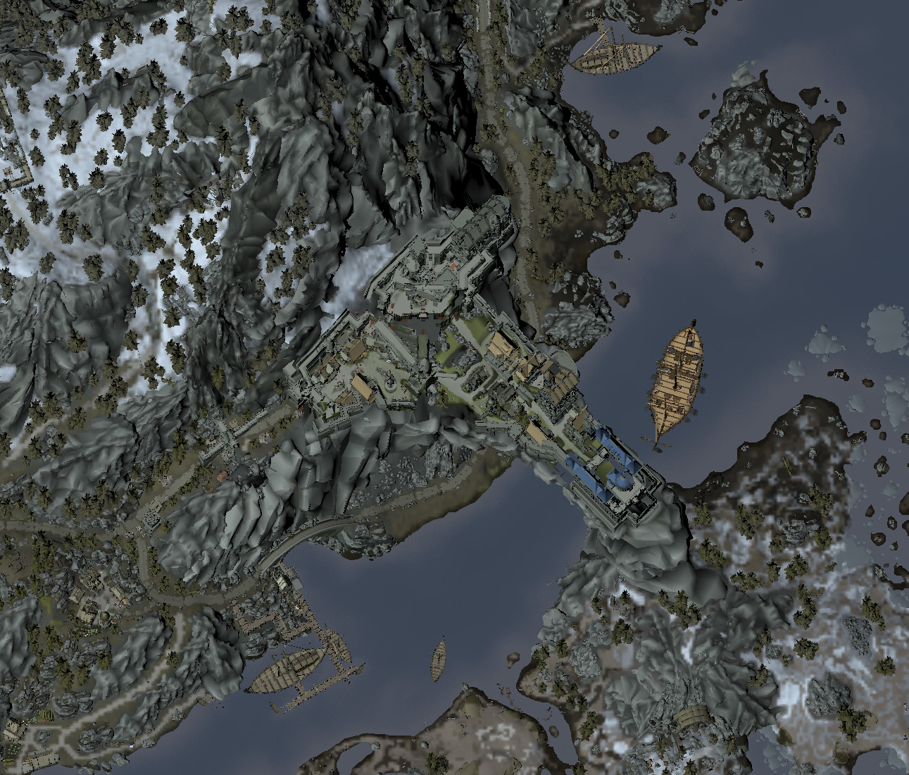
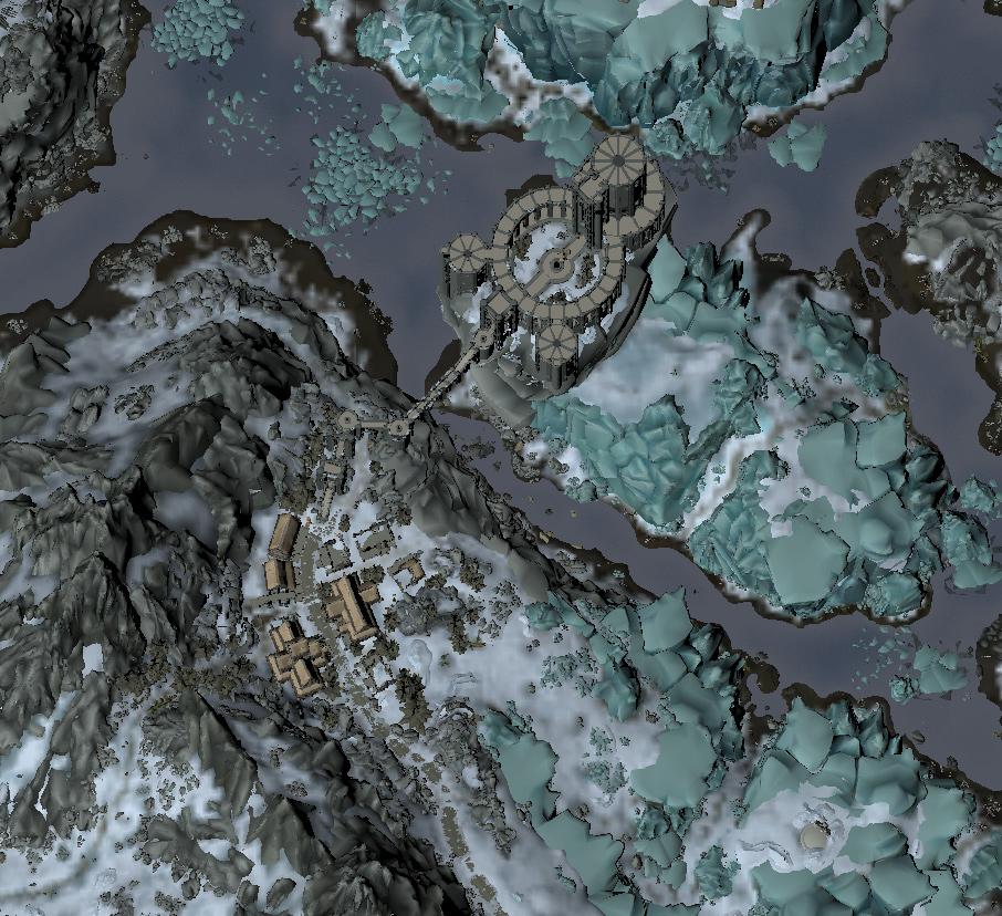
The images are starting to look pretty dang good at this point, but they’re still incomplete. You’ll notice no cliffs of Solitude arching over the Karth River. No cities. No roads. The mountains look cool, but significant rock structures are missing. The sea is free of icebergs. All of these things are stored as “objects” and needed to be decoded.
Objects are basically everything that isn’t the ground (although sometimes they’re the ground, too). Every rock, bucket, sword, anvil, tree, house, wall, ship, plant, and even person is an object. Each unique item has a 3D model and then any number of instances of that model. An instance has a location and rotation, as well as many other properties, but those are the most important for our purposes.
This was definitely the longest journey in the programming phase of this project. 3D models are stored in NIF files in a BSA archive and are very complex chunks of data. It took weeks to get my rotation matrices correct so that the individual parts of an object all oriented together. In addition, various types of objects have unique properties that sometimes required special consideration. For example, certain landscape features seem to adopt the textures of the landscape they’re in, so I had to hack in some special code to handle this as well as I could.
The end result was not perfect, but I had to remind myself of what I was trying to get out of this. At the scale I’d be working at, certain inaccuracies were perfectly acceptable. What motivated me to push through the many difficulties in this stage was the incremental improvements in each image I generated. It was exciting to see the game I loved in ways I’d never seen before.


2. Design Phase
My end goal was not to create a computer rendering. It was to create a hand-inked map on paper. Now that I had code that could access and render the game data in a variety of ways I could start to figure out exactly what I wanted my map to look like.
Imagery
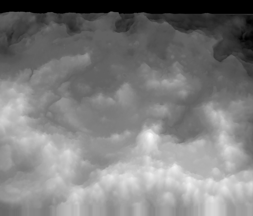
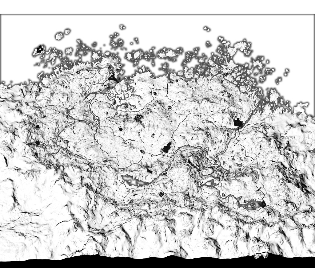
I generated lots of renderings that were very beautiful and vivid, but what I really needed was good tracing imagery. That wouldn’t necessarily be the same as a rich, full-color satellite-style rendering. This image would be shone through paper on a light table which means it had to be high contrast, grayscale, and contain only the details I cared about. Otherwise it would just look like a muddled mess and be difficult to trace.
So what did I want to prioritize? First, the landscape.
Topography
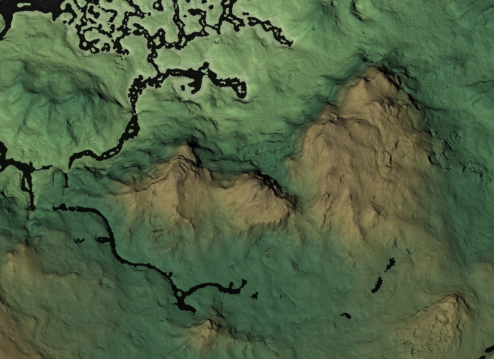
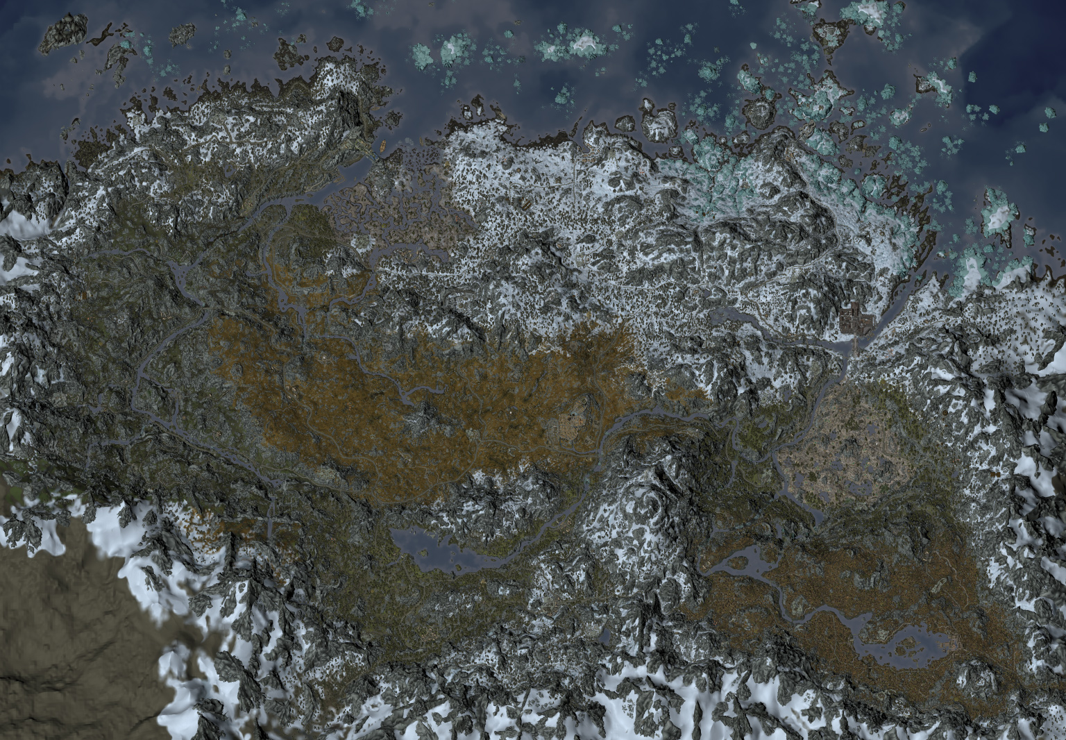
Skyrim is an extremely mountainous world, and it’s not merely decorative. Being able to navigate the terrain is vital to playing the game. That meant some way of visualizing elevation.
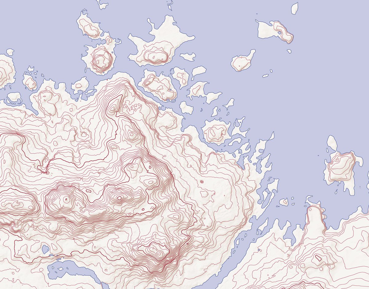
There are many techniques for representing terrain cartography, with merits for each. In addition to visual clarity, I wanted whatever style I chose to be plausibly anachronistic. Contour rings are somewhat modern, in part because they require a lot of precision data. It’s difficult to imagine even the most gifted cartographer inhabiting Skyrim to have accurate altitude measurements at even one location, let alone across an entire province. We don’t really care about absolute elevation anyway, only relative elevation (that is, whether there are cliffs, hills, valleys, or plains in a given area).
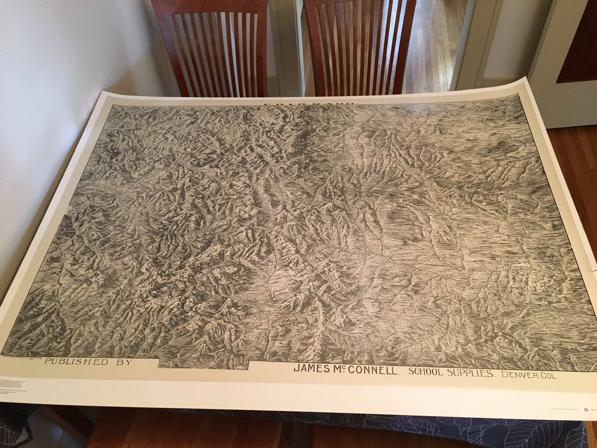
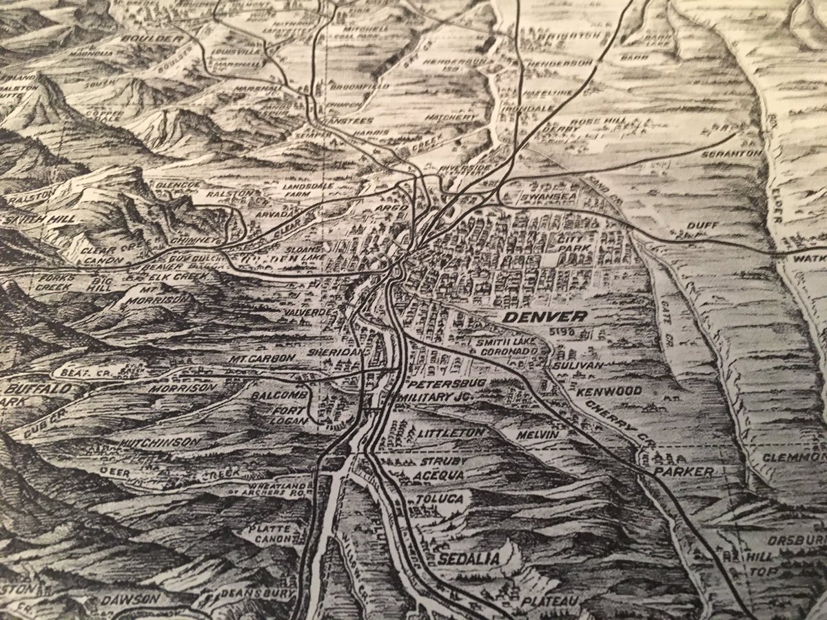
A big inspiration for the route I took was this classroom map of my own state of Colorado dating from 1894. It uses hill profiles, which is simply drawing the hills and mountains at a slightly skewed angle and shading them to give them a three-dimensional appearance. It’s intuitive, attractive, and an anachronistically plausible way of representing terrain.
My rendering would not likely be as ornate, but the general style seemed like a good fit.
Producing source imagery in this style basically just required rendering my images with an oblique projection, applying a light source to give each land feature a realistic 3D appearance, and one more rendering that emphasized edges (somewhat similar to cel shading). I elected to leave out the pretty landscape textures, as it was simply too much visually. This meant I wouldn’t have hints as to the climate of various areas. But I think it was the right choice rather than cluttering things by trying to convey too much information at once.
Objects
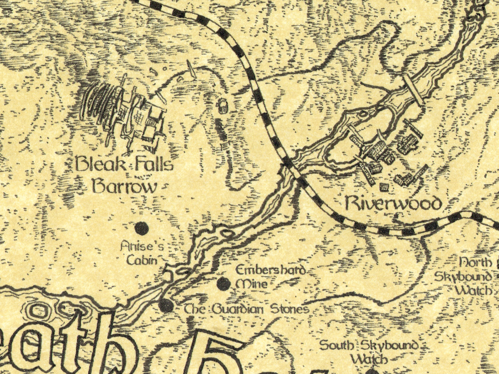
There are thousands and thousands of objects on the map, from pebbles to castles. Some are important; a lot aren’t. I generated many renderings of objects broken up by type. For example, manmade structures in one, large geographic features in another, roads and bridges in another, and so on. I played with the balance of what worked best. I elected to leave out trees, for example. I added extra emphasis to roads. Even when they’re nearly buried by dirt and neglect it’s important to know where they are. Houses and castles were included as general shapes. Large boulders and cliffs were rendered in a similar style as the main terrain data.
Composite Terrain Image
I generated a lot of different visualizations and tweaked them in Photoshop to get the right balance of details.

I pulled the final composite image into Illustrator to add additional design elements manually.
Illustrator Work
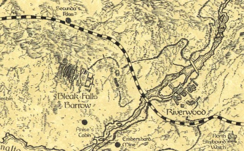
From there I hand labeled every single point of interest on the map. This totaled somewhere north of 300 labels. Although this doesn’t sound particularly difficult, it really was pretty challenging. So much so that I lost steam with the project at this point and set it aside for several months. It was very tedious and difficult to know exactly what look I was going for. After a long hiatus I resolved to not let my hard work fade away and I returned to the task with renewed energy.
Label placement is surprisingly difficult. It must first and foremost be clear. Any given label must clearly be referring to one specific thing and nothing else. For a lone tower in the middle of a field this is easy, but in visually dense areas this can be challenging. The labels must also not crowd one another, both for clarity and aesthetic reasons. One of the most under appreciated aspects of design is whitespace, and I tried to give labels consistent, balanced, pleasing breathing room wherever I could. For locations without visible landmarks I placed a dot to represent its position.
Borders were added based on a combination of existing official maps, fan wikis, and my own artistic license. Borders usually lie along existing features, such as roads, rivers, and mountain ranges, so I used those landmarks to place them. In a world without GPS or commonly available cartography tools, a border would be defined in more descriptive, relative terms. Some borders were scooted one way or another for visual clarity. In the end, these are pretty approximate, and I’m okay with that.
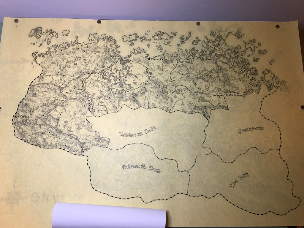
After endless proofreading and sanity checks, the final image was printed on a large format printer at 36×24″ and taped to a thick sheet of clear acrylic. This would be the drawing board, transparent so that it could be used over a light table.
3. Inking Phase
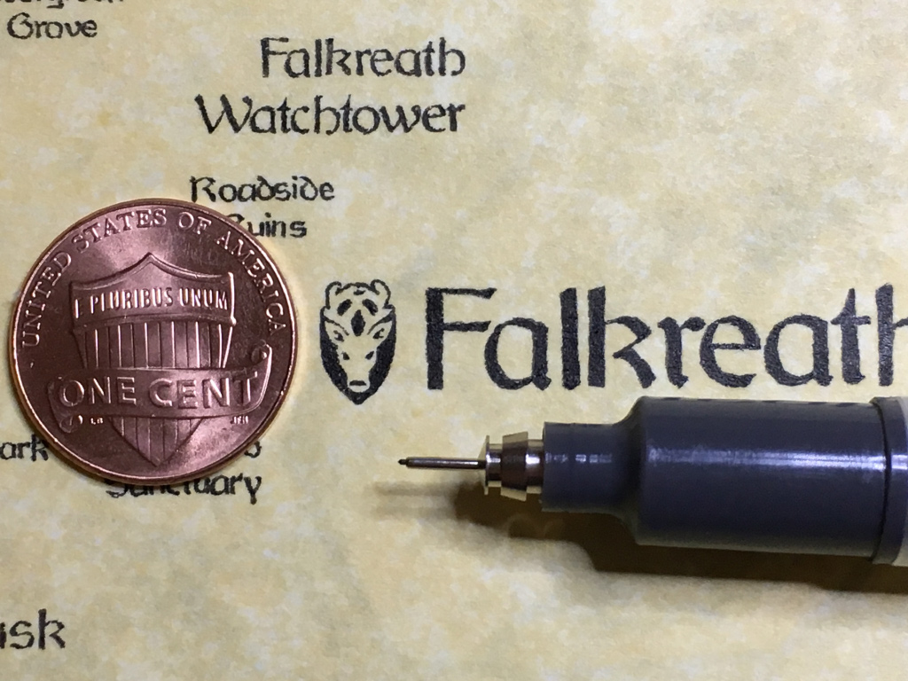
There isn’t a ton to say about this chunk of work. It was lengthy and very tedious, but pretty straightforward. The main challenge was discipline: putting in the time, knowing when to rest, and being obsessively careful about not smudging or sullying the paper.
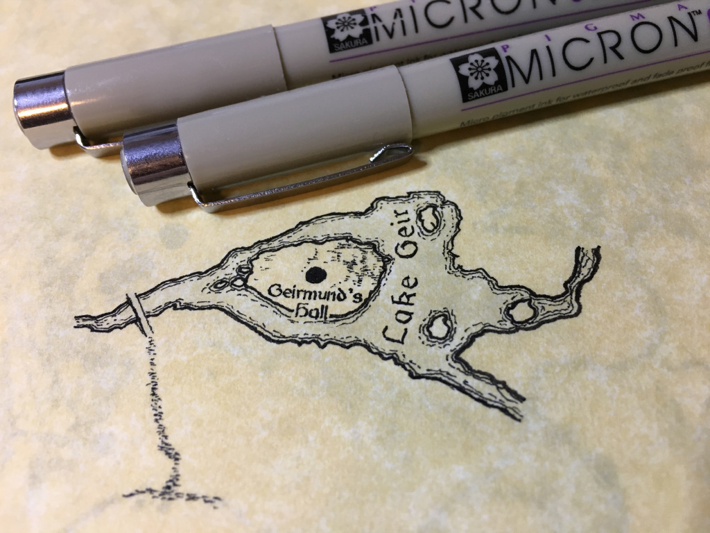
There were some initial experiments to settle on paper, pen, and style choices. My Ultima map was done on mulberry paper with a dip pen. It was miserable, though I love the handmade, organic look of it. I wanted to go a little easier on myself this time and use conventional pens if possible. One limiting factor of handmade papers is what sizes they’re available in. Some were simply too small for the scale I wanted. I eventually settled on using calligraphy parchment and design pens. I’m not in love with the look of the parchment, as I feel it looks rather artificial, but it was the best choice available to me given lots of competing requirements.
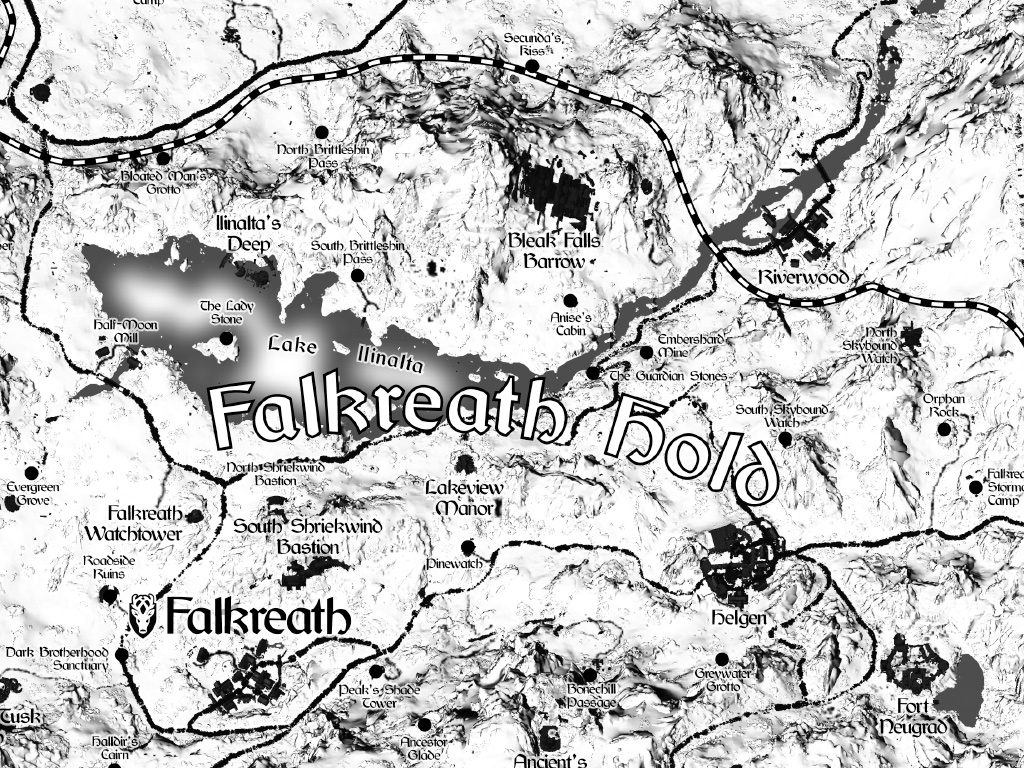
I proceeded hold by hold, top to bottom. For each hold I would start with the location labels, since it’s important nothing else collide with them. Then I’d do shorelines, roads, structures, and end with terrain shading. Each hold took anywhere from a couple days to a week.

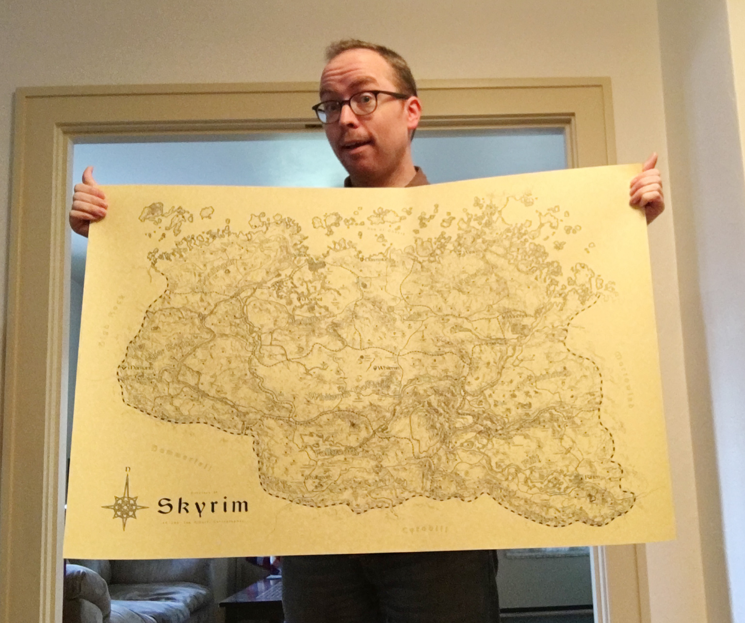
Finished Map
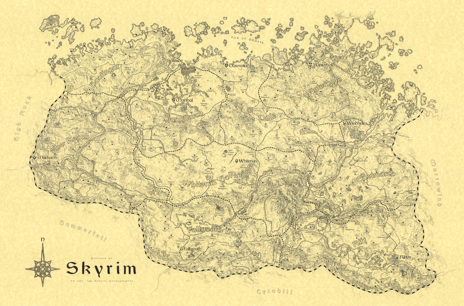
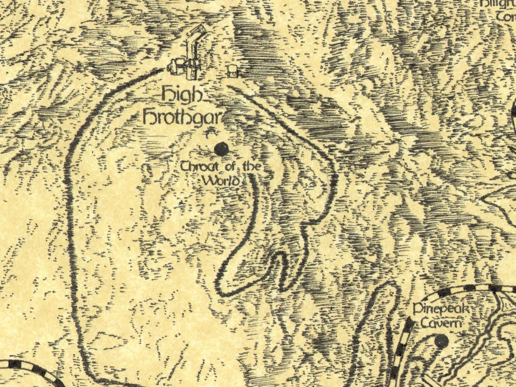
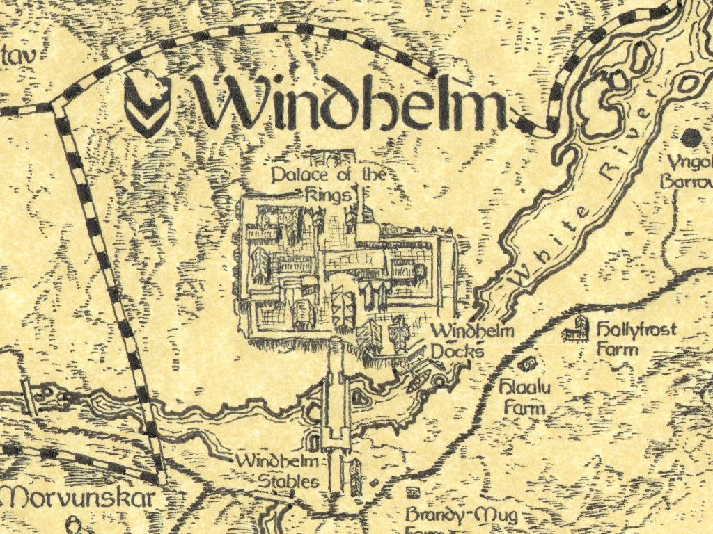
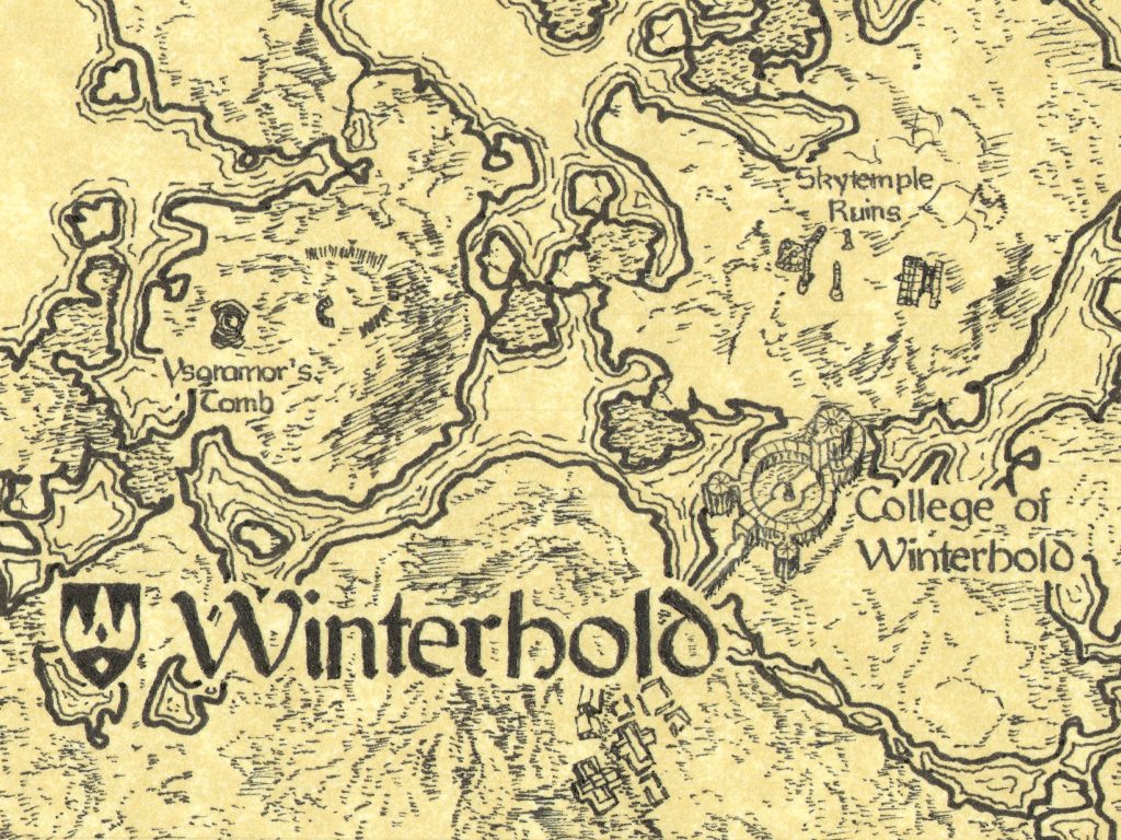
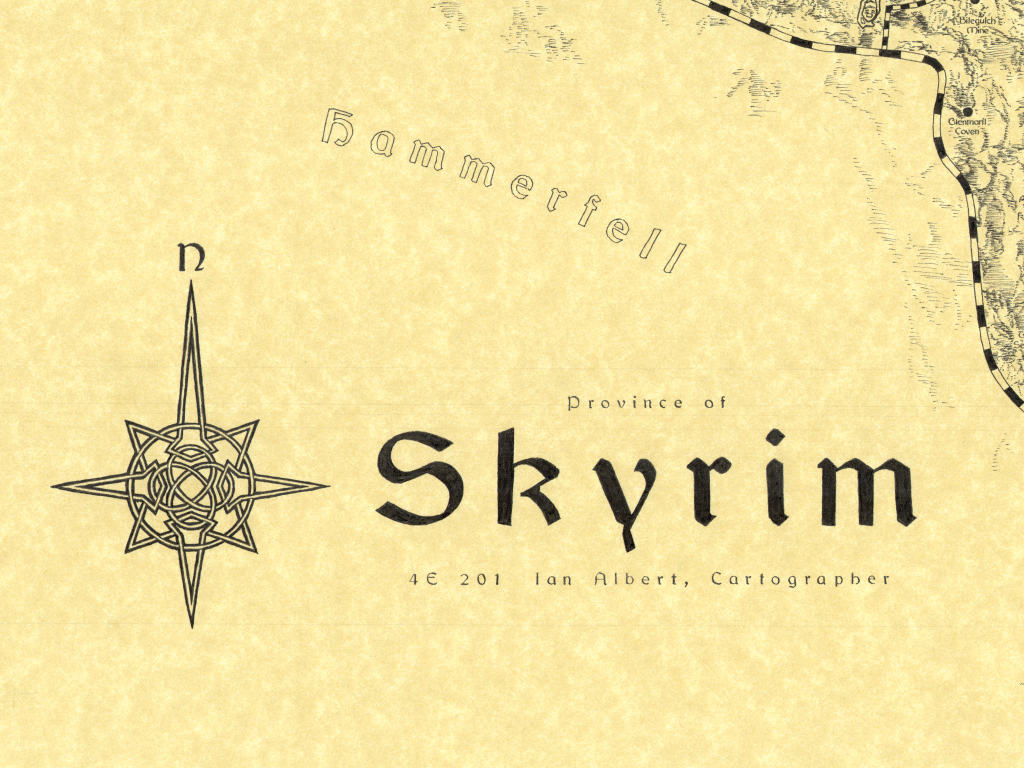
I completed the Skyrim map July 13th, 2017. Here’s the end result.
This is incredible work!! Would you be interested in selling prints?